megha.
Product Designer
loading…


Designed a scalable loan management module for a distributed agent network in India, transforming fragmented workflows into a unified system that reduces friction and enables faster loan processing.
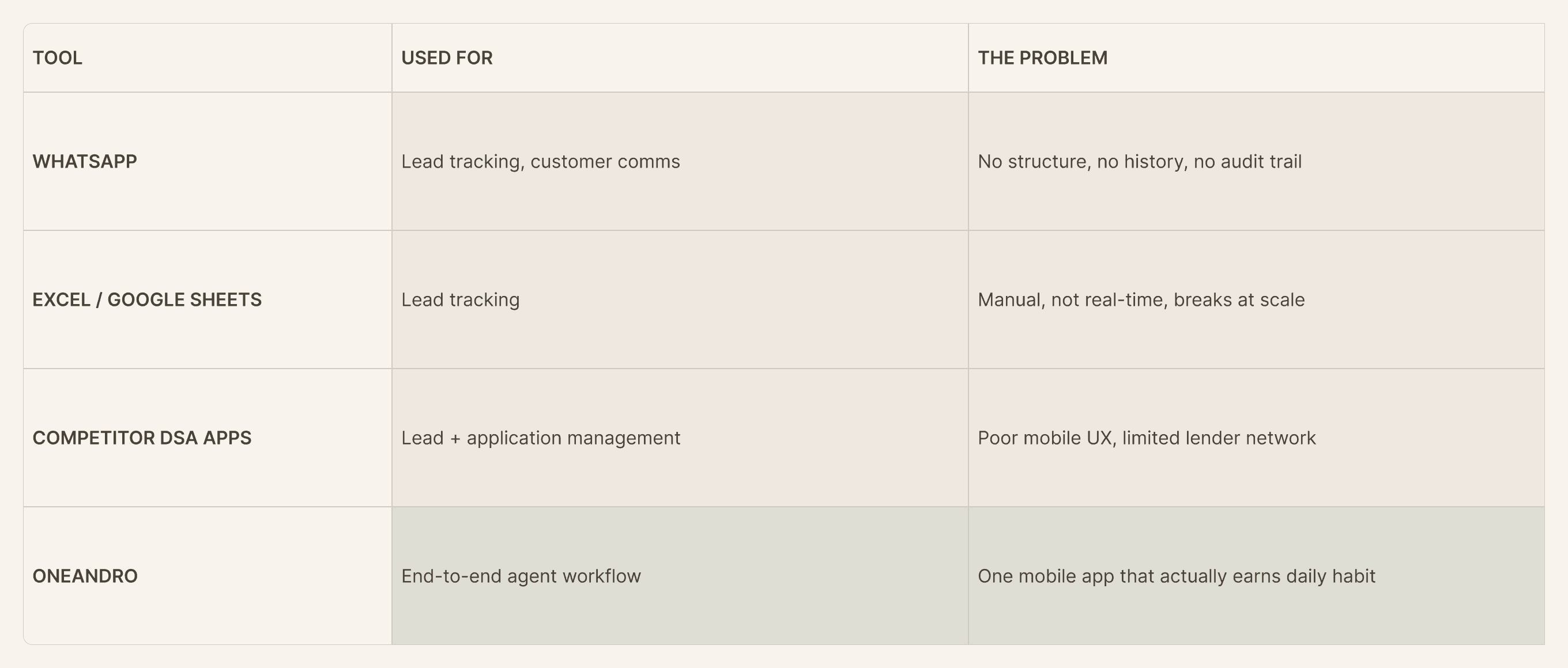
Designed a self-serve data platform to replace manual Excel-based workflows, enabling efficient access and management of large-scale datasets while reducing operational dependency.
Designed a 0→1 XDR platform focused on simplifying how security teams monitor, investigate, and respond to threats through a unified, AI-powered system.

I’m a computer engineer turned product designer. My focus is on transforming complex workflows into simple, human-centered experiences.
Over the years, I’ve worked with startups to large enterprises, contributing both as an individual contributor and as part of cross-functional teams. My experience spans industries like banking, fintech, cybersecurity, logistics, and entertainment — with successful global collaborations.
I take ideas from 0 → 1, build MVPs, and design end-to-end user journeys.
 Miro
Miro
 Claude
Fintech.B2B.2023
Claude
Fintech.B2B.2023Designed a scalable loan management module for a distributed agent network in India, transforming fragmented workflows across multiple tools into a unified system that improves usability, reduces operational friction, and enables faster loan processing.
Andromeda Sales & Distribution is one of India's most established loan distribution companies, with a network of 25,000+ Direct Selling Agents (DSAs) spread across India. At that scale, the business had enormous reach. They wanted to create a unified digital experience for their agents.
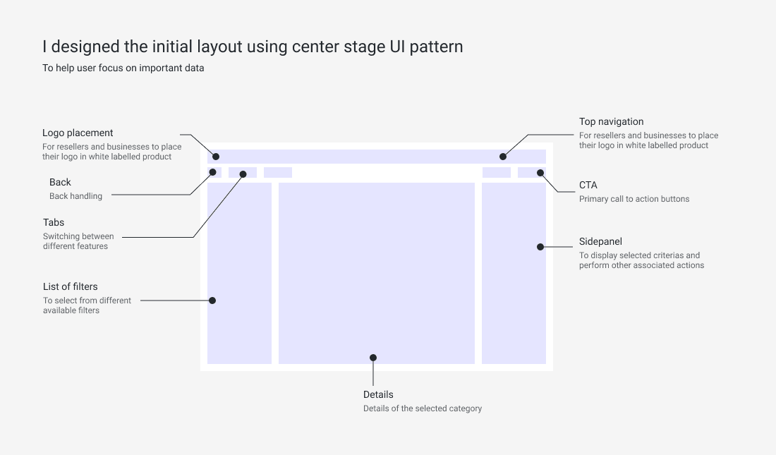
The brief was to design OneAndro — a single mobile platform that could handle the entire agent workflow, from onboarding new customers to tracking loan approvals and earning payouts. The challenge was making sense of how information flows across multiple user roles — and how an agent completes end-to-end loan tracking from onboarding a customer to monitoring loan status.
The stakeholders handed over a full product architecture spanning multiple user types, business rules, and regulatory requirements. I ran structured calls with the PM and business leads and spent the first weeks mapping what existed — no Adobe XD, no wireframes, just understanding the system.
Terms like "DSA," "KYC," "Bureau check," and "disbursement" had precise meanings in this world. I documented every term. The glossary became the shared vocabulary for the entire team and most of it went verbatim into the product's UI copy.
I rebuilt the stakeholder architecture into a clean information architecture: what sections exist, how they connect, and what each user role can see and do. Role-based information scoping was designed into the IA from week one.
I shared clickable low-fidelity wireframes early and used stakeholder walkthroughs to surface business rule conflicts before engineering began. The KYC flow went through 3 full rounds before sign-off.
The platform served financial agents (DSAs) and several internal roles. Everyone needed to see what was happening — and what to do next.
Progressive disclosure — show only what the agent needs right now.
Enter data once. It flows through every downstream step.
Every stage of a lead visible — no black boxes, no phone calls to check.
Each role sees only what's relevant to them — same underlying data, role-aware UI.
Intuitive for first-time users; efficient for experienced ones.
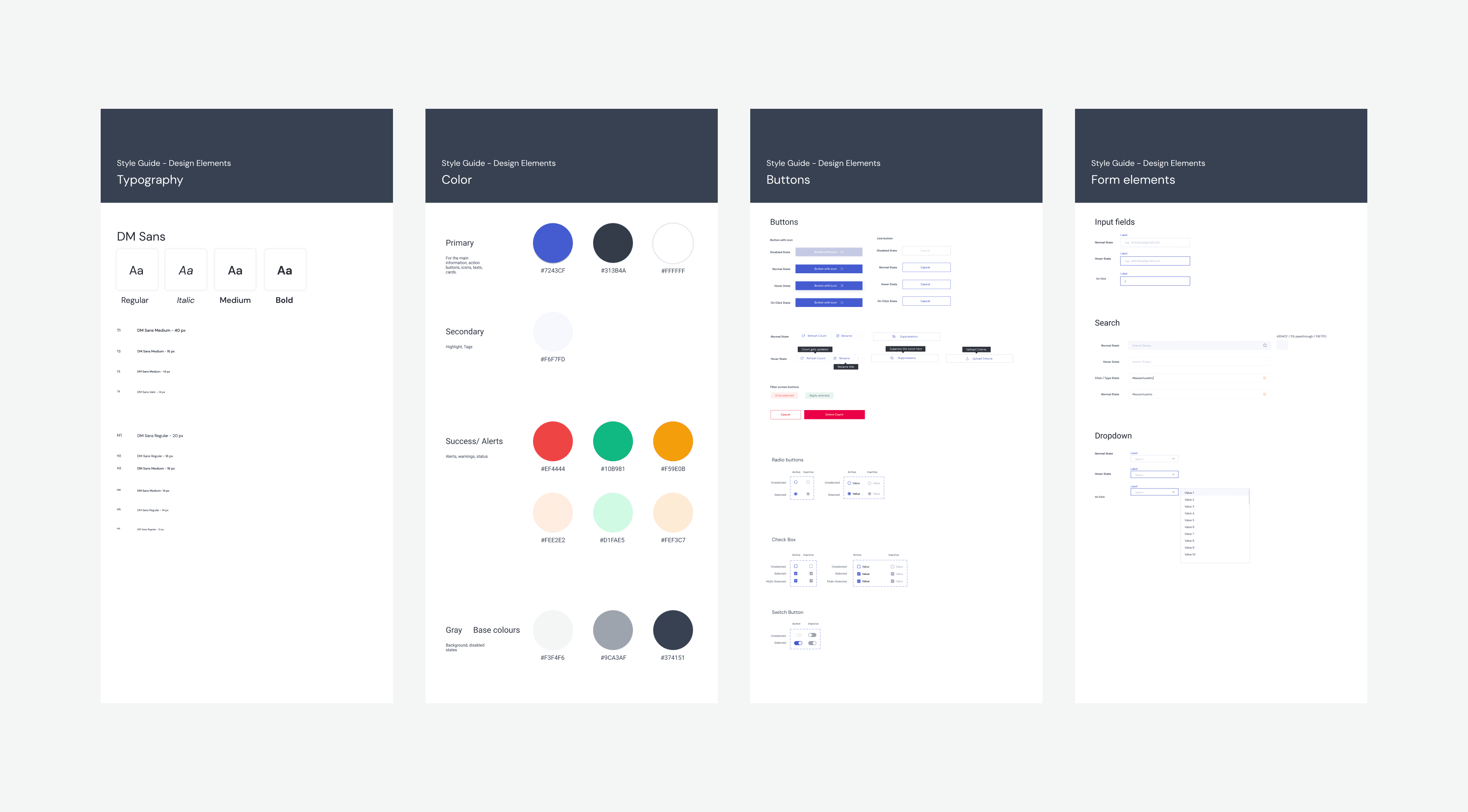
Across 3 user types and dozens of screens, I identified shared UI patterns — status cards, form flows, action sheets — and consolidated them into reusable components to ensure consistency and reduce design debt.
Every screen was designed around the agent’s primary action at that moment. Secondary data was available but visually subordinate. This reduced cognitive load in the field where agents are often distracted.
Network errors, incomplete KYC, and bureau check failures are common in the field. Every major flow has a defined error state, a recovery path, and inline guidance — designed to prevent agents from abandoning a lead.
The KYC and pipeline flows each went through 3 full review cycles. Feedback came from product, compliance, and operations leads. Each round tightened scope and sharpened the UI.
Handoff included annotated Figma screens, component usage notes, spacing specifications, and clear state documentation for complex components like the pipeline status chips.
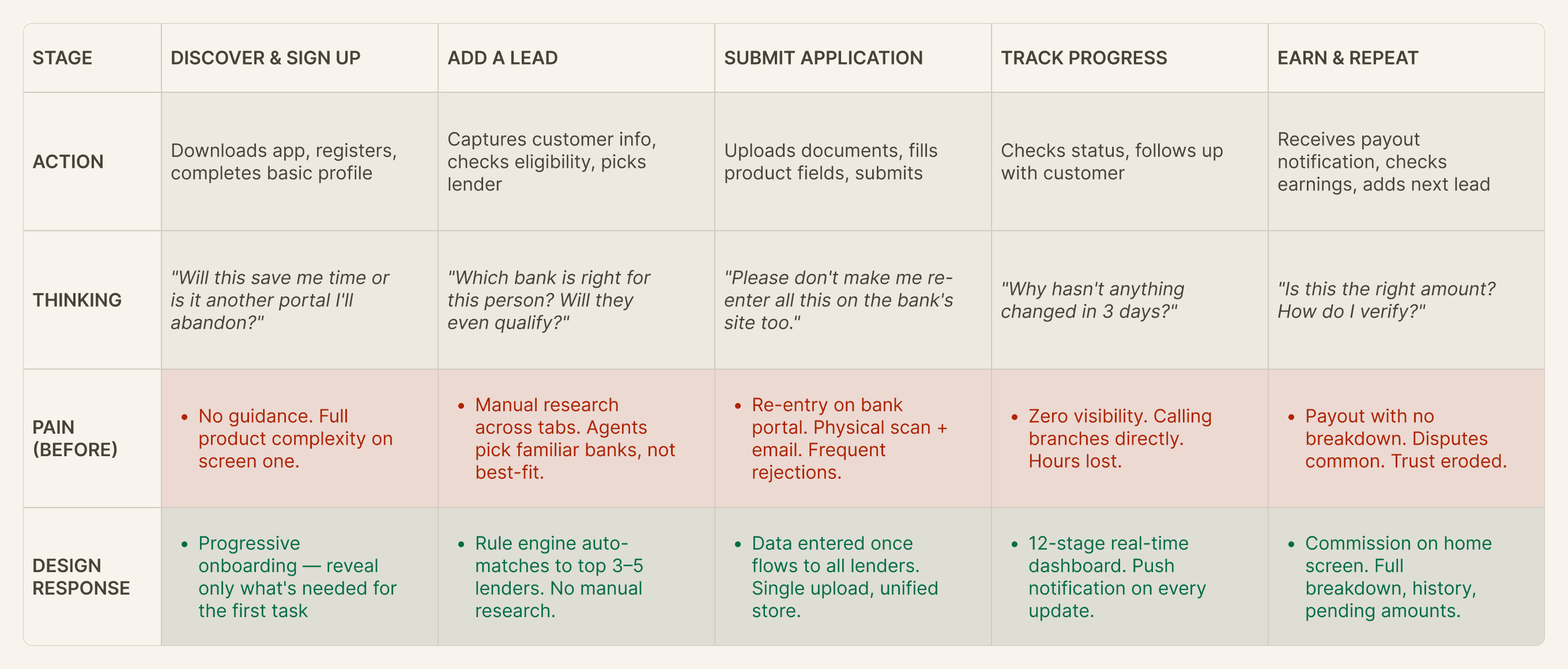
Mapping the full agent journey — what agents were doing, thinking, and experiencing before OneAndro, and the specific design response at each stage. This map anchored every wireframe.


Measurable outcomes from the live product — validating that the design decisions translated into real-world impact.
* Metrics referenced from publicly available sources and industry reports. Specific figures may vary.
The most impactful decisions weren't about screens. They were about information architecture, role boundaries, and eliminating redundancy in the underlying process.
Designing for non-tech-savvy agents in smaller cities forced us to remove jargon, reduce steps, and add feedback at every point. The experienced agents loved it too.
A flow diagram is abstract. A clickable wireframe is real. Running walkthroughs early is the single highest-leverage investment in any product design process.
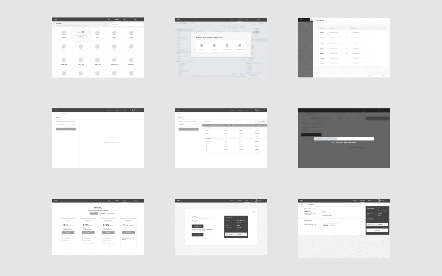
SaaS.2022Designed a self-serve data platform to replace manual Excel-based workflows, enabling efficient access and management of large-scale datasets while reducing operational dependency.
The client operated a large-scale marketing data platform serving businesses and marketers. Despite having extensive data available, access was entirely manual — sales teams managed every request through Excel sheets, filters were applied inconsistently, and customers needed a support rep to complete even a basic list pull. The goal was to build a self-serve web platform that puts the full power of the data directly in users' hands, without friction.
The sales and product teams had very different mental models of how the platform should work. I ran structured calls to map the gaps before any design work began.
Terms like "suppression," "count," "list pull," and "deduplication" had specific meanings here. I documented them all — it shaped both the IA and the UI copy directly.
Marketing managers and resellers had fundamentally different needs and workflows. I designed an IA that served both without forcing either into an uncomfortable experience.
Count updates live with every filter change. No waiting. No recalculation requests to a rep.
Not a side step. Built into the journey so it's never skipped.
Cost visible at every step — before the user commits to anything.
Power users can revisit, duplicate, or modify past counts without starting from scratch.
A structured multi-step process from database to purchase. Helped first-time users but felt too rigid for experienced ones. Added friction for users managing multiple lists daily.
A dashboard-style experience where users manage counts, filters, reports, and history from one interface. Balanced guidance and flexibility for both new and power users.
Measurable outcomes from the live product.
Iteration 1 wasn't a failure — it taught me exactly what to fix, at wireframe stage, before any hi-fi work.
Designing for the power user (reseller) improved the experience for first-timers too. Edge cases force structural clarity that benefits everyone.
Suppression was skipped for years because the design made it forgettable. Moving it in-flow fixed it overnight.
Cybersecurity · Enterprise · 2024Designed a 0→1 XDR (Extended Detection and Response) platform focused on simplifying how security teams monitor, investigate, and respond to threats through a unified, AI-powered system.
A cybersecurity client needed a 0→1 XDR (Extended Detection and Response) platform for enterprise SOC teams. The goal: a single unified interface for threat detection, investigation, and response.
Security teams were juggling multiple tools — separate dashboards for threat detection, investigation, and response. Context got lost between switches, alert fatigue was high, and decisions were slow.
Given the tight deadline, scoping the MVP required a system design approach. Before committing to any feature, I mapped how each feature connected to others — which screens were dependencies for other screens, which flows shared components, and which features couldn’t function without something else being built first. This dependency map became the backbone of the Phase 1 decision. The founders then cross-referenced it against what was business-critical for their enterprise buyers, and together we landed on the final list.
The final list was decided together with the founders — they knew what enterprise buyers expected at launch, I knew what could be realistically designed well in the timeline.
I started with low-fidelity wireframes and walked the client through every flow before moving to high-fidelity. The goal was alignment on structure before investing in polish.
Severity-grouped triage view. Enough context per row to act without opening the alert.
Timeline-based incident flow. Detection → root cause, all in one scrollable panel.
Dashboard showing active threats, lateral movement, and attack surface across the environment.
Query-based threat hunting across the full data corpus. Built for analysts who know what they’re looking for.
Policy-driven detection rules. Analysts define conditions; the system acts when thresholds are met.
The design system was built dark-mode first — analysts work in low-light environments for long shifts. Every component was designed for scannability under pressure: clear severity hierarchy, minimal chrome, high signal-to-noise ratio.
Before locking designs, I sat with the dev team to understand technical feasibility — data refresh rates, backend constraints, what could realistically be built in the timeline. Some screens needed rethinking. Knowing early saved us from painful revisions later.
Also helped with branding — logo, visual identity, colour story. The client wanted something that felt enterprise-grade but approachable.
We went from zero to a working product — design system, full UX & UI across all core screens, branding, and dev-ready specs. The platform unified detection, investigation, and response into one experience.

Built end-to-end with AI using Figma Make during the Figma Make-a-thon. Watercolor paintings in the browser — brushes, blending, canvas controls.
Try Aurora live ↗Motion design concept to highlight critical KPIs — ensuring vital data grabs attention without overwhelming. Micro-interaction driven.
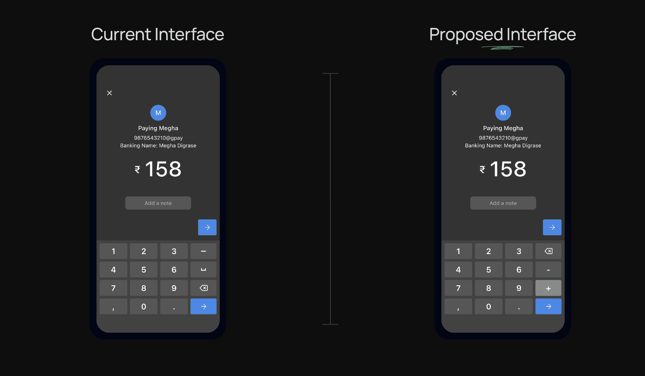
Watch concept ↗A concept feature within a Digital Wallet for adding the cost of a product bought at the last minute. Reduces payment friction.
A concept design feature within Digital Wallet for adding the cost of a product bought at the last minute.
While using a UPI wallet to make in-store payments, I observed a recurring pain point: when customers add an additional product at the last minute, they need to re-enter the entire payment amount. This small friction creates cognitive load and disrupts the checkout flow.
This concept aims to streamline the experience by allowing users to add the payment amount directly inside the UPI interface — making digital transactions faster, more human, and closer to how we naturally handle money in real life.
Today's UPI payment flow assumes the total amount is known upfront. However, in real purchase scenarios — especially in grocery stores, pharmacies, and local shops — the total often changes at the last moment.
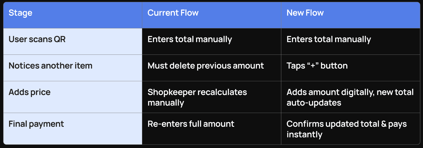
This idea originated from a personal incident. I had already entered an amount into my UPI app and was about to pay when I picked up one more product. I had to delete the entered value, wait for the merchant to calculate the new total, and re-enter the amount manually. I noticed similar behavior among other customers in multiple shops.
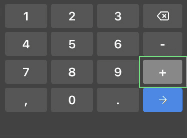
A “+” button inside the digital wallet interface itself, allowing users to add amounts directly without re-entering the full total.
Despite its usefulness, this feature may not exist yet in leading UPI apps due to: